

MTG Therapy Services
MTG—short for Model, Teach, Grow—is a speech therapy practice dedicated to helping students strengthen communication skills through personalized therapy and partnerships with local schools.
I partnered with the founder to establish the brand identity and develop a cohesive visual system, including custom iconography and supporting brand elements.
Expertise
Art Direction
Brand Identity
Visual Systems
Iconography

Brand Identity

Primary Logo
MTG’s primary logo pairs a refined wordmark with a custom emblem, balancing warmth and professionalism while introducing the organic forms carried throughout the identity.
Logo Breakdown
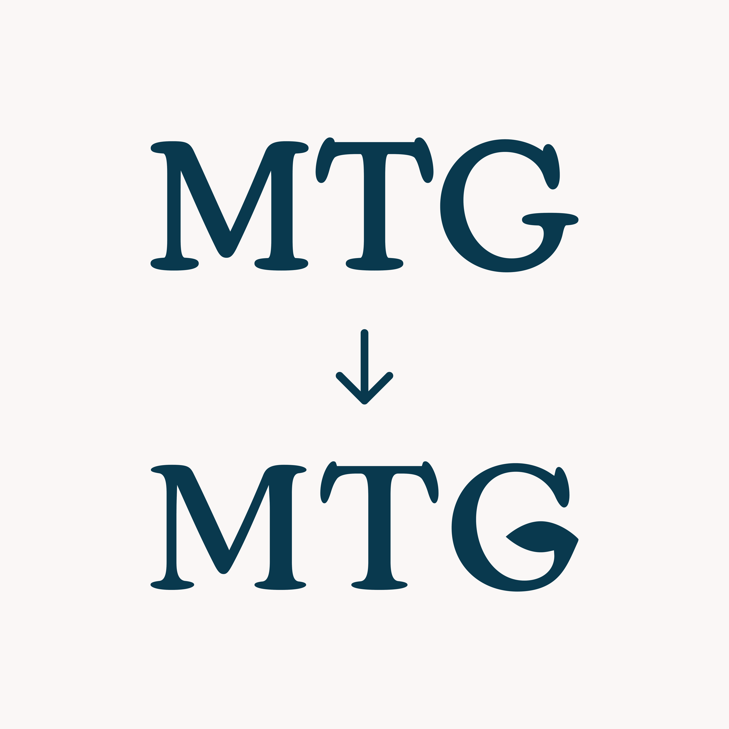

Type
Refined the letterforms to create a distinct, approachable wordmark while maintaining clarity and balance.
Emblem
Built the emblem from simple, organic forms representing the relationship between the student, language, and therapist.
Core Icons
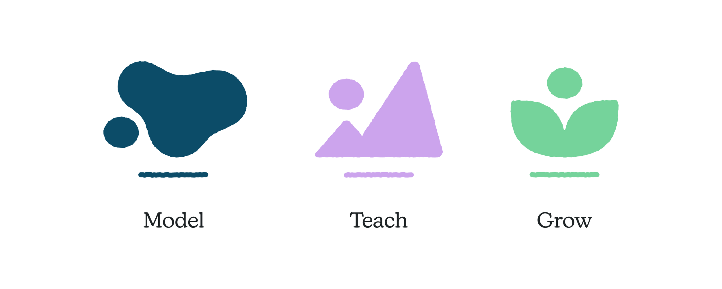
Developed a cohesive, nature-inspired icon system around MTG’s three core pillars: a fluid form for Model, mountain peaks for Teach, and leaves for Grow.
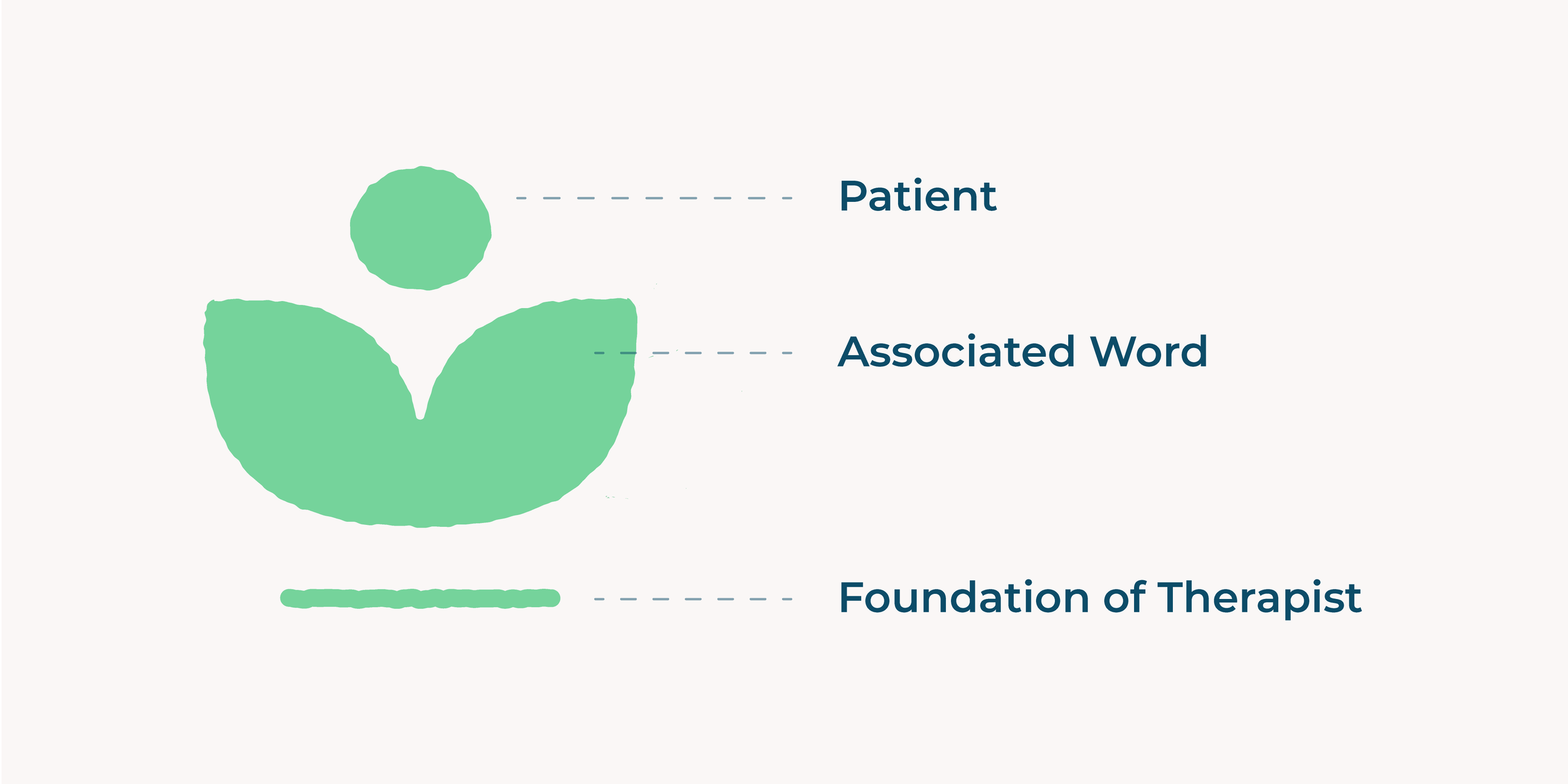
Shared Symbolism
Each icon follows a shared structure: the patient above, an associated symbolic form at the center, and the therapist as the foundation below.
Visual System
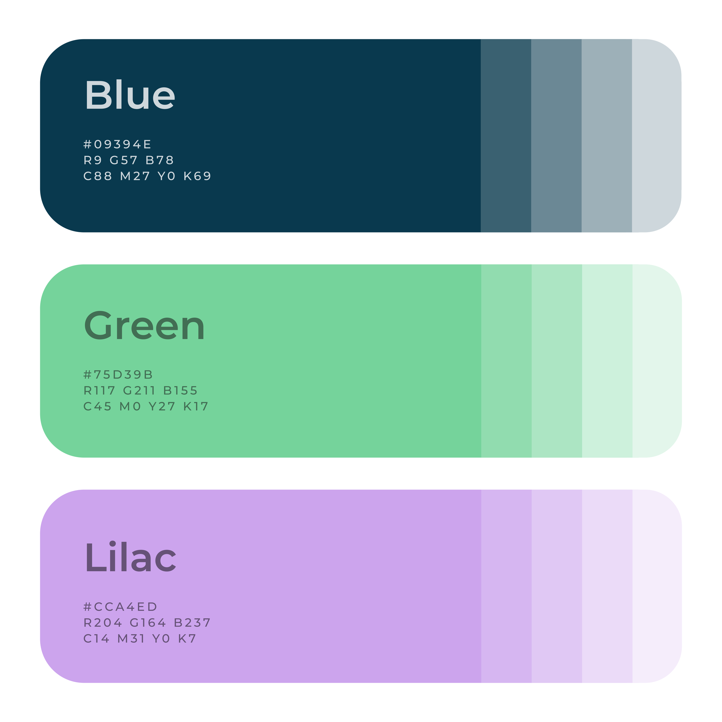
Extended the identity into a cohesive visual system of color, supporting graphics, patterns, and iconography.
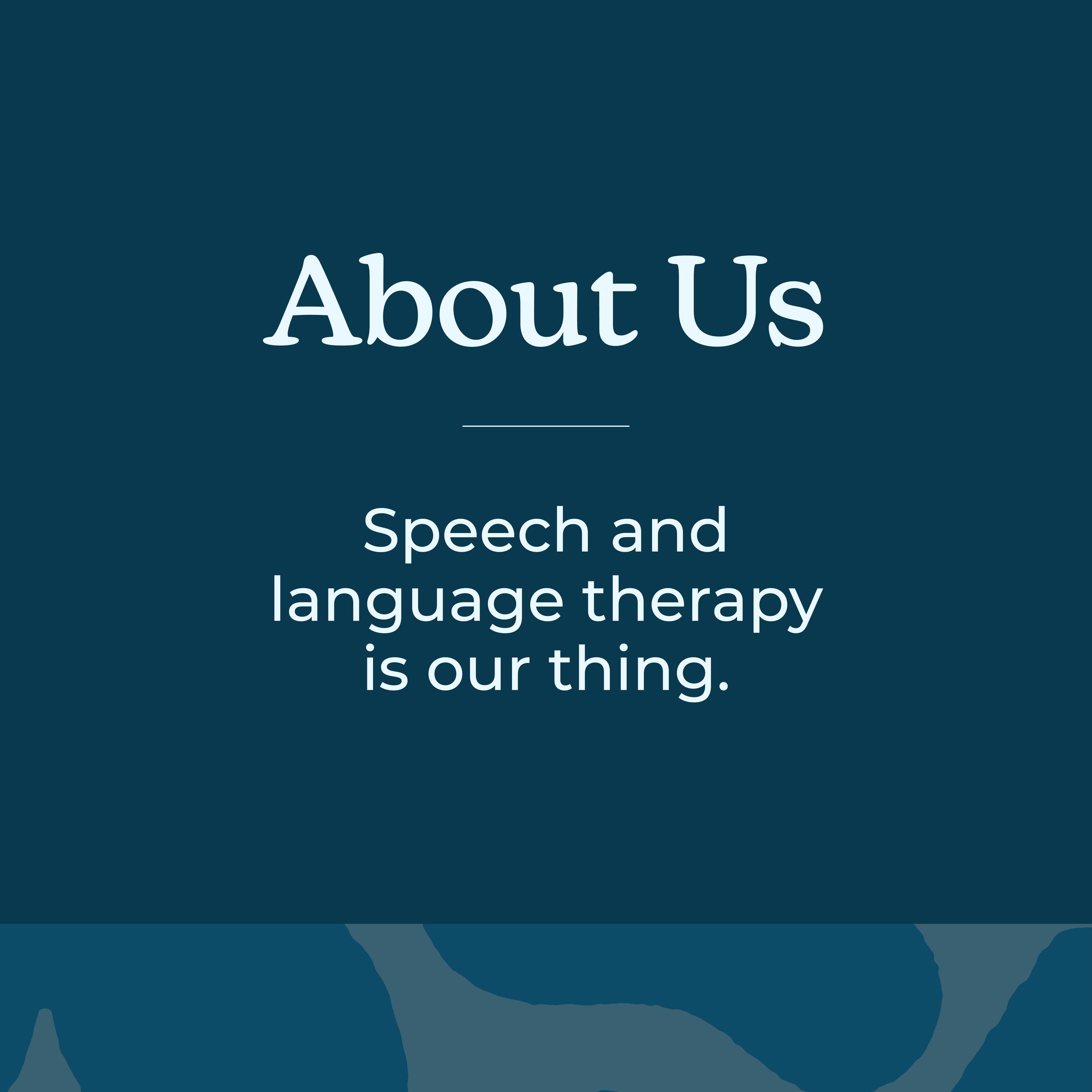

Secondary emblem variations extend the identity across applications.

Patterns derived from the emblem create a flexible graphic element for the brand.
Supporting Icons
Created service-specific symbols that extend the visual language across MTG’s key offerings.

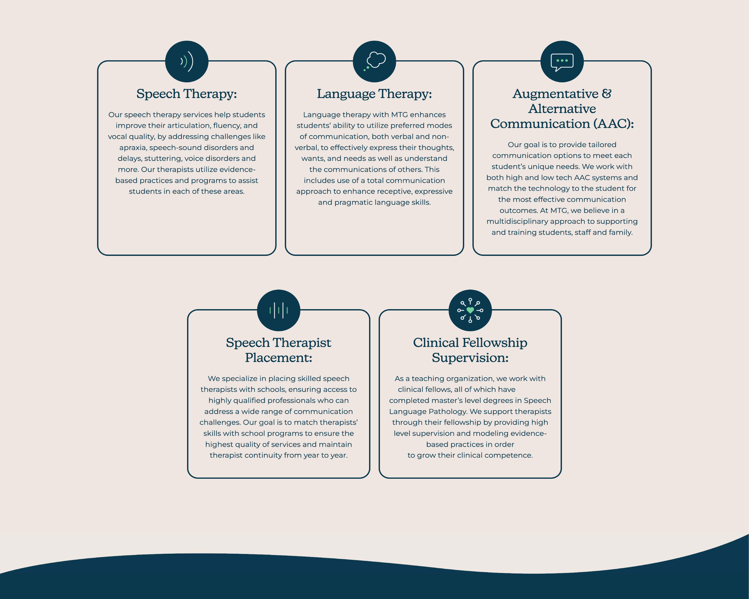
The icons were then provided to the external web team for implementation.